Interactive racial population dot map
By Fred Elbel on 16 August 2014
The interactive Racial Dot Map shows one dot per person for the entire United States. This July, 2003 interactive map shows population density and racial composition of US population.
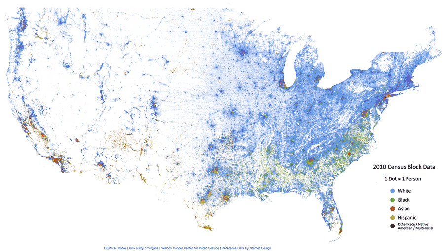
Racial dot map of the United States, July, 2013

Racial dot map of the Colorado Front Range, July, 2013
From the web site:
This map is an American snapshot; it provides an accessible visualization of geographic distribution, population density, and racial diversity of the American people in every neighborhood in the entire country. The map displays 308,745,538 dots, one for each person residing in the United States at the location they were counted during the 2010 Census. Each dot is color-coded by the individual's race and ethnicity. The map is presented in both black and white and full color versions. In the color version, each dot is color-coded by race.
All of the data displayed on the map are from the U.S. Census Bureau's 2010 Summary File 1 dataset made publicly available through the National Historical Geographic Information System. The data is based on the "census block," the smallest area of geography for which data is collected (roughly equivalent to a city block in an urban area).