The African behemoth
Africa is a huge continent. To see how truly large the African continent is, Visual Capitalist compiled this map showing how many other countries would fit within the continent of Africa. Mapped: Visualizing the True Size of Africa, VisualCapitalist, February 19, 2020:

Note that the African continent easily contains the countries of United States, China and India. From the Population Reference Bureau 2019 World Population Data Sheet, the current and projected populations of these countries are as follows:
| Country |
Population |
Projected population |
Rate of natural increase |
| United States | 320 | 388 | 0.3% |
| India | 1,391 | 1,670 | 1.3% |
| China | 1,398 | 1,367 | 0.4% |
| Total | 3,109 | 3,425 |
Thus the three most populous countries on earth are projected to grow from 3.1 to 3.4 billion people over the next 30 years - a 10% increase. This is a huge projected increase within the finite boundaries of these countries, but it pales in comparison with that of Africa.
PRB shows the rate of natural increase of all countries in an interactive map. Rates of natural increase of African nations varies from 1.9% to 3.8%. For example, the rate of natural increase of Niger is 3.8%
In order to understand the significance of the natural increase percentages, the Rule of 70 can be used to find the population doubling time. Simply divide the percentage number into 70 to obtain the approximate number of years required to double. That yields the following table:
| Country |
Rate of natural increase |
Years to double population |
| United States | 0.3% | 233 |
| India | 1.3% | 54 |
| China | 0.4% | 175 |
| Niger | 3.8% | 18 |
A few notes about the above table:
-
The rate of natural increase rarely remains constant over time. Thus the above table is an approximation of population growth if the rate of natural increase were to remain constant.
- The rate of natural increase is low for the U.S., where women voluntarily reached replacement level fertility in 1972. In the U.S., Canada, and Europe, population growth is being driven by mass immigration. Indeed, mass immigration is driving America's population to double this century.
Another view of population dynamics is shown by the PRB interactive Fertility Rate map, which shows fertility rates as:
| Country | Fertility rate |
| United States | 1.7 |
| India | 2.2 |
| China | 1.6 |
| Niger | 7.0 |
Clearly women of Niger - and of many African countries - have large numbers of children compared to the rest of the world.
While the staggering size of Africa can be visualized from the map shown above, it's harder to visualize the impact of Africa's exploding population growth, but this graph shows it well:
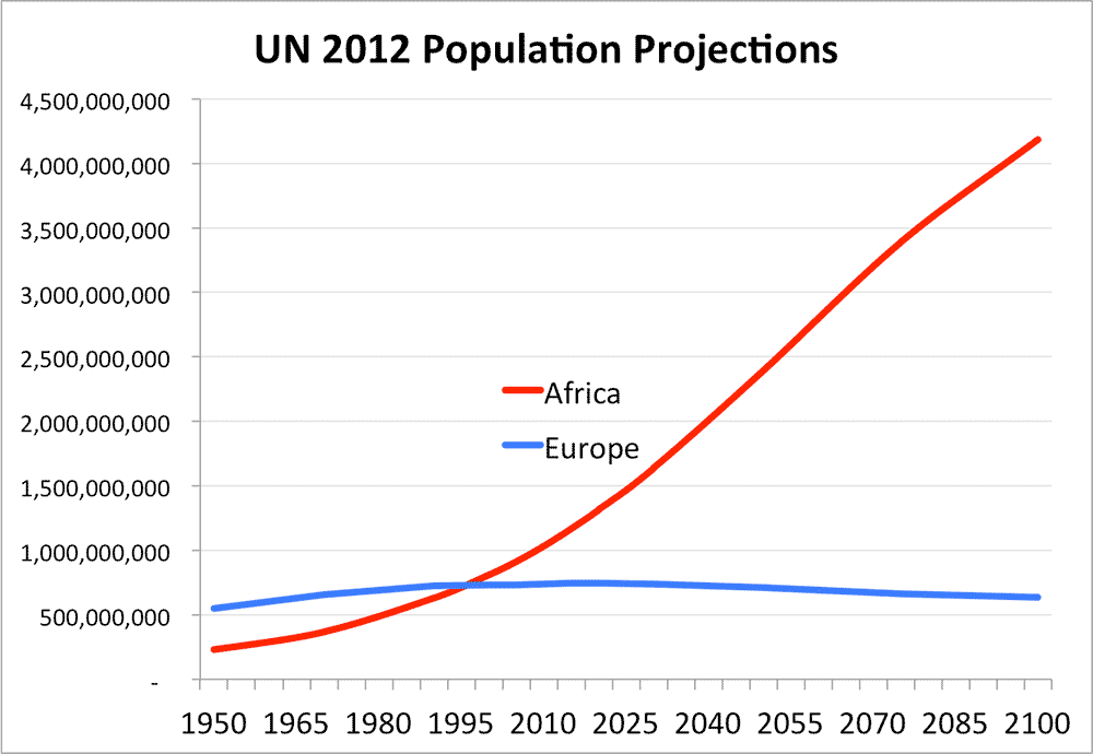
For more information on the impact of Africa's exploding population, see The World's Most Important Graph, which projects incredibly high population growth of Africa compared to Europe. Also see The World's Most Important Map.